
UX Design・UI Design・Website・Client Project・Clinical Research
QD Connect: a mobile app for study participants
QD Connect is a mobile app designed to support participants enrolled in long-term clinical research trials, by helping them understand their study, track their progress, and prepare for upcoming study visits.
Project Overview
Role
Product Design Lead, owning the product vision and direction
Team: Designer, Developer, Copywriters, Creative Director
Methods + Tools
1:1 User Interviews・Empathy workshops ・Ideation workshops ・Crazy 8’s ・Impact/Effort Matrices・User flows・Wireframes ・Figma prototyping
Figma・FigJam・Miro・paper + sharpies
About the Project
QD Connect is a mobile app designed to support participants enrolled in long-term clinical research trials, by helping them understand their study, track their progress, and prepare for upcoming study visits.
Before QD Connect, participants would have received a paper guide (which was hard to update in case of study changes, and easily misplaced), or a link to a progressive web guide (which was not customizable for each patient, and could be difficult to quickly navigate).
After research into the clinical trial experience, speaking with past study participants, QD Connect was conceived to help patients navigate the complexities of clinical trial participation. Our goals were to create an app that could easily slot into their existing routines, check their daily study responsibilities, understand what each study visit would look like, and easily contact study staff. For the study teams and sponsors, we aimed to make it easier to update available information, complying with protocol updates, and improve patient retention.
Constraints + Considerations
QD Connect had several constraints impacting its design and development, including:
Accessibility: Study participants may greatly vary in age, health conditions, and familiarity with apps
Clinical trial regulations: Including patient privacy and communication, study updates, and study protocol variation between countries
Customization: The app would need to have a base template that could be modified to fit any study, as not all clinical trials have the same study structure. This also includes custom branding for each study.
Users: An early vision for the app included an interface for both the study clinic and the study patients. However later on, there was a directive to decrease clinic staff burden, necessitating a shift away from including direct study staff input into the app.
Business constraints: This was the agency’s first mobile app, and was created alongside regular agency work. There were a few bumps along the way, and the app faced competing internal priorities, extending its design and development over the span of ~3 years in total.
Process
Research
After deciding that we wanted to reimagine our existing print and web study guides, we set out to determine what experience would be most useful to clinical trial participants. Due to privacy regulations, we weren’t able to speak directly to patients who had used our agency’s materials. Instead, I created a research plan for 1:1 discovery interviews with people who had recently participated in a clinical research trial.
Research goal: What tool can we create to best assist patients participating in a long-term clinical trial?
Core research questions: How do patients stay organized during long-term clinical trials? What is the trial experience like in between clinic visits? What information do patients need to reference most often during the study (and what do they not need)?

Empathize → Ideate → Implement → Test
Sketches
I began the design process with low-fidelity sketches to quickly brainstorm and visualize key pages and features of the website, including the pre-screener questionnaire.
Noting the desire that users like Michael had for transparency and clarity in treatment, I wanted to provide clarity while filling out the pre-screener. My hope was that showcasing transparency at the very beginning of their journey in this clinical trial would give them confidence and trust for the later stages of their journey.
I chose to show each question individually on screen so as to not overwhelm the user with a long list of questions. At the same time, I wanted to let the user know how long they would be filling this form out for, so included a progress bar.
After sketching, I opted to use the "bubbles" for the progress bar, to clarify how many questions the user would have to answer and how far they were (i.e. one bubble per question), rather than a percentage-based progress bar, which can make it difficult to discern your true progress.
Wireframes
While translating my sketches into low-fidelity wireframes, I added in the approved copy so that I had accurate content to work with.
After creating the progress bar for the screener at this stage, I realized that the "bubbles" looked very similar to the radio buttons. Not wanting to confuse the bar with the radio buttons, I moved to using a set of bars in the high-fidelity stage.


Empathize → Ideate → Implement → Test
Visual Design
Moving into the high-fidelity stage, the main factor I wanted to keep in mind was visual accessibility. I opted to use high contrast colors, and a large base font size.
The base color palette and typeface selection came from the client-approved brochure concept created by our Art Director. This initial branding was modified slightly later on, and the updated branding would lead to a modification of the site’s look.


Empathize → Ideate → Implement → Test → Ideate (again)
Testing feedback
A prototype for the website was included as part of an internal usability test for a separate tool (a client portal that received submissions from the questionnaire). After testing, we had a few minor changes to make, such as clarifying the “submit” screen at the end of the questionnaire. The largest changes came as requests from the client. These included moving the questionnaire to sit on the homepage, rather than on its own separate page, and implementing the branding changes.
Empathize → Ideate → Implement → Test → Ideate (again)
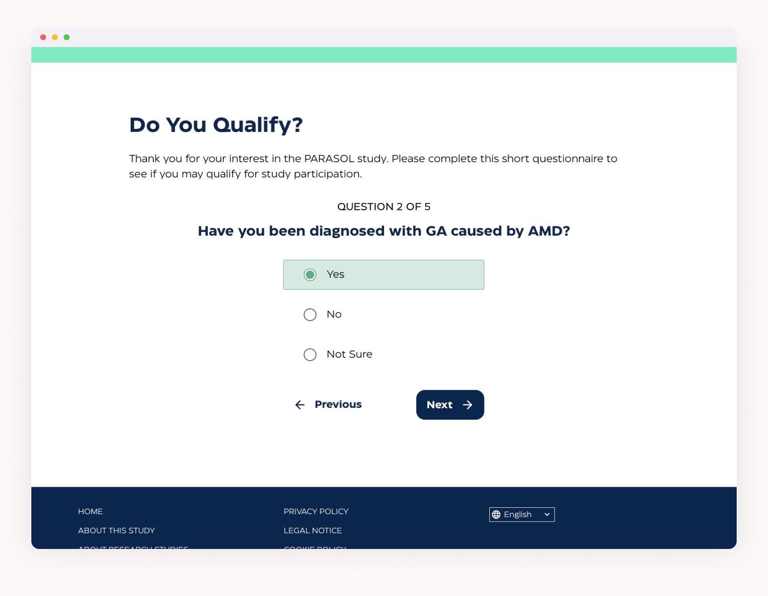
Revised Screener
The screener was moved to the home page with the intention of increasing potential volunteers for the trial. With this, we also changed the order of the screener.

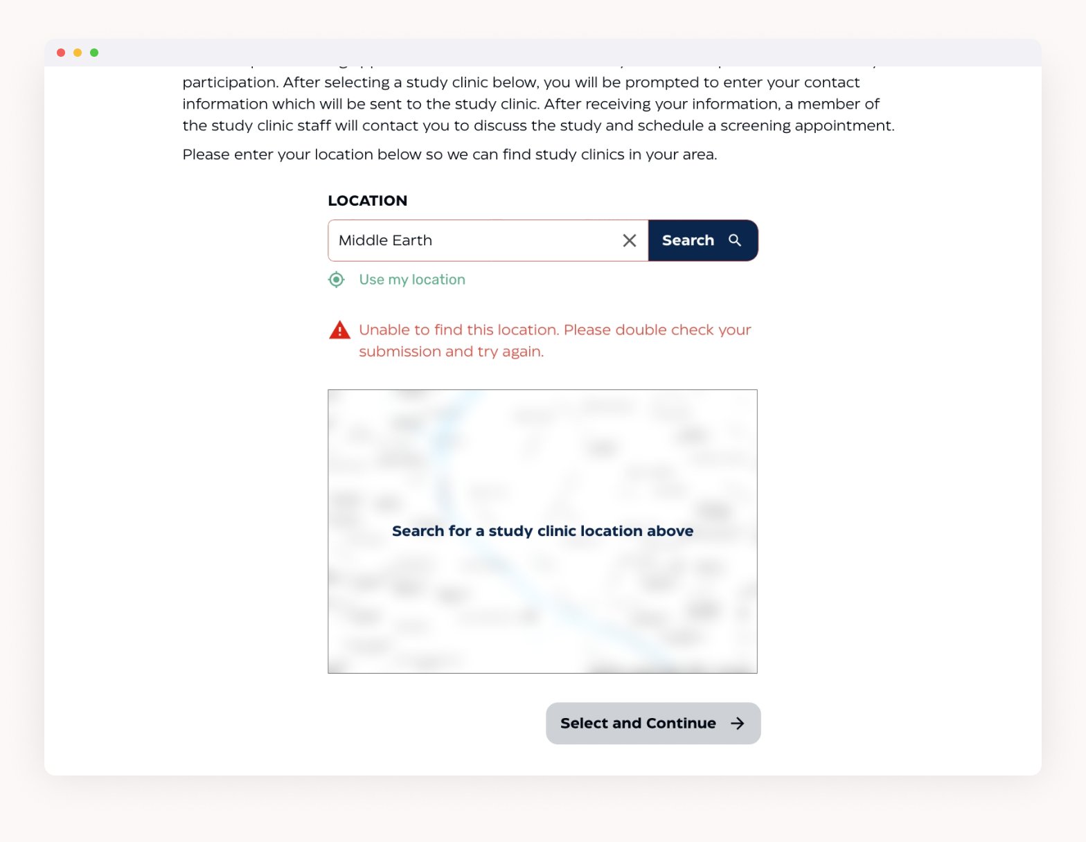
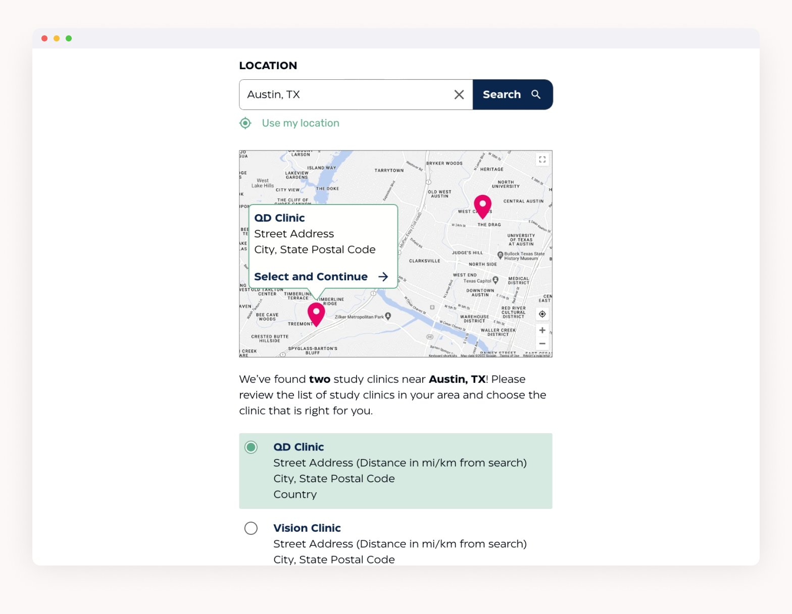
Initially, users had to enter their location first, before answering any questions. The location entered could prohibit patients from taking the screener at all, if there was not a clinic nearby. With the update, the patient answers the questions first, to see if they can qualify. Then, they search for a study clinic and are given a map to accompany the list of clinics. This way, the user is given the ability to choose how far they’d be willing to travel for a clinic, rather than deciding for them.

UI Updates
The need to update the branding gave the opportunity to refine some of the UI treatment as well. Colors were slightly tweaked to adhere to the new brand style guide, and the typeface was updated as well.

→
Original design system
To improve the experience of the site for users that may be using a text-to-speech screen reader, the progress bar was nixed in favor of a text-based progress indicator (for example, “Question 1 of 5”). Similarly, a label for the text size toggle was added.

Updated design system


Takeaways
This project challenged me to put the needs of a visually impaired user front and center, and really made me realize just how much more I can learn about accessibility. After this project, I’ve been trying to build more knowledge of accessibility in UX and UI design.
The process of creating this site also highlighted several opportunities to improve on our web process. We initiated discussions between the design and development teams to learn more about processes, and improve our handoff. We’ve also been talking with the copywriting team about how we can have a more collaborative process between our teams, rather than working separately and each team feeling limited. In addition, we began to streamline a basic design system and components library that we will be able to use as a launch point for future web projects. Our hope is that this will decrease the amount of groundwork needed for the design process, so we can spend more time refining our designs.